

OMVI / William AI
From a conversation
to a clear next step.
OMVI / WORLD MOBILE / WILLIAM AI
OMVI brings people, AI agents and shared knowledge together to turn conversations into coordinated work. William, its AI assistant for World Mobile, combines text and voice interactions with a workspace designed to support product discovery and network-building activities.
The challenge was to connect a conversation with the work that follows. Questions could lead to research, planning or content creation, involving several specialist agents. Bringing these activities into one experience meant keeping information, decisions and progress connected as users moved between them.

A useful answer needs context. A useful assistant needs a path to action.
OVERVIEW
Turning AI capability into
an experience people can use.
My work focused on the human-facing layer: where people start, what they can inspect, how they follow agent work and what they control before taking action.
01
Help in context.
An embedded assistant sits beside the existing page, with a fuller Studio for ongoing work.
02
Outputs people can inspect.
Cards, transcripts and task states give AI responses a practical form.
03
Design that survives handoff.
Shared components, explicit states and engineering feedback connect the prototype to implementation.
01 / THE CHALLENGE
One assistant.
Very different reasons to ask.
World Mobile combines mobile services with a community-built network. Its users need help with everything from choosing an eSIM to developing a local network area.
The programme’s discovery material described fragmented customer data, disconnected product journeys and a support team managing questions across multiple channels. William was intended to make that information more useful through contextual answers and guidance.
The design challenge was deciding where the assistant belongs, how much context to show and what happens after an answer. A subscriber asking a product question needs a different experience from a Network Builder managing a 90-day activation journey.
A note on the product names
01
Help in context.
An embedded assistant sits beside the existing page, with a fuller Studio for ongoing work.
02
Outputs people can inspect.
Cards, transcripts and task states give AI responses a practical form.
03
Design that survives handoff.
Shared components, explicit states and engineering feedback connect the prototype to implementation.
02 / UNDERSTANDING & SCOPE
Start with the task.
Then choose the surface.
I worked from client requirements, programme discovery documents and journey work led by our service designer, Laila Parbhoo. The product owner shaped user stories and priorities. My contribution was translating those inputs into interaction flows, screens and prototypes that the team could review and build.
RESPONSIBILITY
WHAT MATTERS TO THEM
DESIGN RESPONSE
Public visitor / subscriber
Understand a product or find help.
Suggested questions and a compact assistant.
Network Builder
Understand progress and decide what to do next.
Goals, progress widgets and contextual coaching.
Affiliate
Find guidance on codes, campaigns and acquisition.
Contextual information and campaign-related workflows.
Internal operator
Review work, tasks and supporting information.
Sessions, task boards and supporting context.
These are roles and scenarios documented in the project materials, rather than personas validated through independent user interviews. “Alan” and “Mike” were demonstration scenarios for new and returning users. OMVI’s GTM buyer profiles describe enterprise purchasing concerns; they are separate from these William user scenarios.
START WITH
Contextual questions
Guest and signed-in states
Focused coaching
START WITH
Projects and sessions
Boards, grids and canvas
More detailed work
START WITH
Authentication and continuity
Data availability
Voice and integration states
THE SYSTEM BEHIND THE INTERFACE
A workspace for people
and agents to work together.
William’s conversation is an entry point into a larger experience: context, tasks, agent activity and review.
OMVI’s public website presents a platform organised around seven areas: Studio, Prism, Visor, Core, Fuse, Grid and Vault. The investor presentation describes agents with different responsibilities, including planning, execution, review and documentation. This explains the wider intent behind the Studio interface.
PLATFORM INTENT
WHAT THIS MEANS FOR THE EXPERIENCE
Retain useful context
Give conversations and transcripts a place within sessions and projects, so people can continue the work.
Coordinate agent work
Make tasks, assignments and progress understandable without requiring the user to read backend logs.
Keep action accountable
Distinguish a suggestion or draft from an action, and make review and the next step clear.
These are UX implications of the platform direction. The original requirements, design files and review records establish my contribution; the complete 19-slide Figma presentation and public positioning provide additional context.
START WITH
Contextual questions
Guest and signed-in states
Focused coaching
START WITH
Projects and sessions
Boards, grids and canvas
More detailed work
START WITH
Authentication and continuity
Data availability
Voice and integration states
These are the platform areas presented by OMVI. My contribution shown here concerns the workspace, orchestration of work and its interaction patterns, rather than ownership of all seven areas.


03 / DESIGN DECISIONS
The decisions
behind the screens.
Four interaction problems that shaped the experience.
01
CONTEXT & ATTENTION
Bring help to the page.
Expand when the work needs it.
THE PROBLEM
People could enter William from several World Mobile surfaces. Asking a question should not require learning a full workspace first.
THE DESIGN
I designed a compact assistant with suggested questions, conversation and coaching views. Guest and signed-in states make the difference between general help and personalised, retained work visible.
THE TRADE-OFF
A side panel preserves page context but reduces space. Tabs give each view more room but require switching. The Studio explorations considered both approaches; their comparative usability was not established through end-user testing.

Embedded help, with the underlying page still visible. (Guest state design)
WHY IT MATTERS
The interface offers a low-commitment way to ask a question, with a route into more detailed work when the user needs it.
02
VOICE & CONTINUITY
A call should become
something you can return to.
THE PROBLEM
Voice, live transcription and suggested actions compete for attention. Ending a conversation also raises a practical question: where does its useful content go?
THE DESIGN
I used the right sidebar for live transcription and moved actions into the command bar. The call indicator lets the session remain visible while the user continues working.
THE TRADE-OFF
The demo-preparation discussion added collapsible panels to recover workspace space. The voice-app exploration also lets users choose a transcript range before opening it in William.

Early voice-continuity wireframes. The annotated intent is that leaving a call returns the person to their previous view and attaches the transcript to the conversation stream. The board also explores a separate Call History tab. This documents intended behaviour, not verified production behaviour.

During the call: conversation and supporting context.
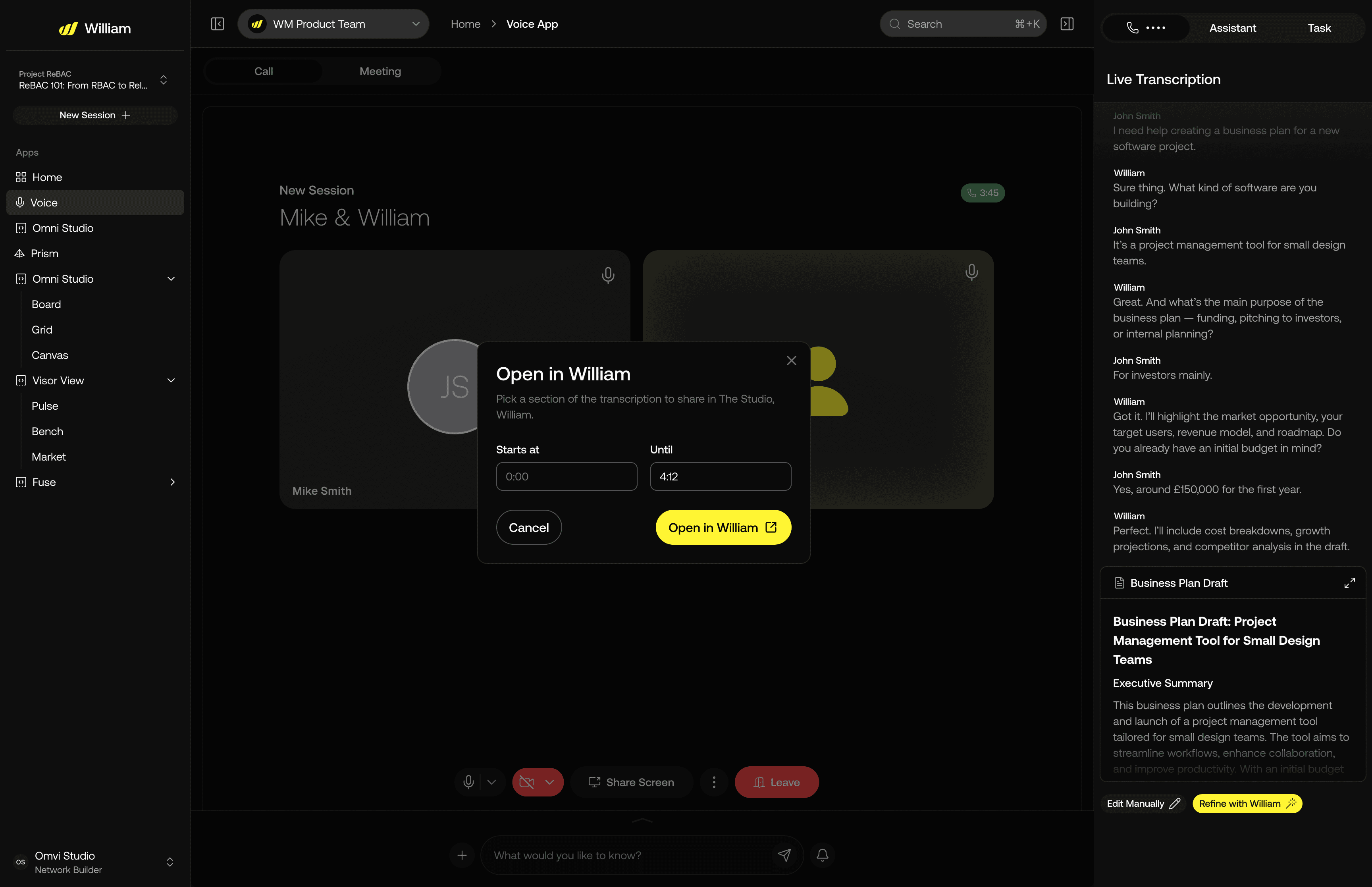
Continue the work: choose what to take into William.
Exploration / in progress
EARLIER DIRECTION
Several boxes competing for actions and context.
REVISED DIRECTION
Transcript in the sidebar. Actions in the command bar. Panels that can collapse.
This change is recorded in the original demo-preparation transcript. Product feedback contributed to the collapsible-panel decision; it was a team refinement.
WHY IT MATTERS
The interface offers a low-commitment way to ask a question, with a route into more detailed work when the user needs it.
03
ANSWERS & ACTIONS
Give the answer
a useful, inspectable form.
THE PROBLEM
A paragraph can answer a question, but prices, calendar availability and draft content need different structures and next steps.
THE DESIGN
The interface combines conversational explanation with context cards. A pricing card supports scanning and comparison; a calendar card supports scheduling; a draft can be reviewed before an external action.
THE TRADE-OFF
A well-presented card does not prove the answer is correct. Data recency, retrieval failures and human confirmation still need explicit treatment.

Structured information, with the next action beside it.
The pricing card pairs the answer with comparable product information, recency and direct actions. Content and prices are illustrative Figma data.

When retrieval fails, the response says so.
The error state makes the missing data explicit and offers a refresh instruction. The original design does not establish whether users understood it or recovered successfully.
04
PROGRESS & AGENT WORK
Show the task.
Then show the work behind it.
THE PROBLEM
The Network Builder brief combined a 90-day countdown, subscriber growth, coverage and operational tasks. The wider Studio also needed to make agent work understandable to people.
THE DESIGN
I brought goals, subscriber trajectory, scan coverage and business-plan actions together. My Studio work included agent cards and swim lanes showing task progress and assignments, making ongoing work visible alongside the conversation.
THE TRADE-OFF
Agent names and technical detail can overwhelm users. The useful information is what the task is, who is working on it, how far it has progressed and what the person can do next.

A task-level summary, with agent-stage progress available to inspect.

William Studio board showing tasks in Discover, Define, Defer, Design and Develop lanes, with agent labels and Run Task controls.
TWO LEVELS OF DETAIL
The board offers an overview of tasks. The grid exposes the work within a task: which stage is complete, which is active and which is waiting. This makes a multi-agent process more legible. Time, token and cost fields show the intended monitoring detail; they do not establish model accuracy or business value.
90
days
The brief proposed weekly checks, progress explanations and contextual nudges for Network Builders. Its 1,000-subscriber goal and progress thresholds were programme targets. They are not results of my design.
04 / A SHARED INTERACTION SYSTEM
Reuse the foundation.
Design the behaviour.
A component library matters most when its states and patterns match the work people are trying to do.
The shared OMVI library uses a shadcn/ui foundation. I worked with that existing base and product-specific components for navigation, prompts, context cards and call states. The files include brand variants and active, inactive, disabled, typing and call-in-progress states.
My contribution was adapting and extending the experience around those components, then supplying visual references and clarifying missing states with developers. The underlying UI kit was not built from scratch by me.
NAVIGATION

Keep context and action areas predictable.
INPUT

Carry one interaction pattern across surfaces.
ONGOING WORK

Make persistent activity visible.

05 / COLLABORATION & DELIVERY
The design continued
after the prototype.
My work included presenting flows, clarifying interaction states and helping engineers connect the screens to real constraints.
01
I brought goals, subscriber trajectory, scan coverage and business-plan actions together. My Studio work included agent cards and swim lanes showing task progress and assignments, making ongoing work visible alongside the conversation.
02
Engineering asked what an uploaded-file card should display under the one-file constraint. Product feedback added a visible drag-and-drop target and clarified replacement through deleting and re-uploading. These discussions made the handoff more specific; the comment thread alone does not prove the final implementation.
03
The team discussed command-bar consistency, guest-session behaviour, brand differences and voice performance across Edge and Studio. I contributed UI references, chat refinements, profile work and research into voice-reactive animation.
WHAT THE REVIEW COULD TELL US
Reviews helped check requirements, flow logic and implementation details. Stakeholders brought domain knowledge, but also product familiarity. They could not establish how easily an unfamiliar subscriber or Network Builder would understand the interface. This work is not presented as a completed representative-user usability study.
06 / OUTCOMES & REFLECTION
A clearer model for
working with William.
The contribution I can show is the design of the experience around the AI: entry, conversation, context, action and continuity.
Interfaces made concrete
Contextual help, Network Builder coaching and voice-to-workspace flows were expressed as screens and prototypes for review and development.
Agent work made visible
Task cards and board layouts communicated progress, assignments and ways to act on the work.
A reusable delivery foundation
Shared interaction patterns and explicit design states gave the team references to implement and refine across product surfaces.
The records show demonstrations and active development. They do not establish a single final launch date, complete rollout or measured task-time reduction. OMVI’s investor revenue and growth figures describe the company; they are not results attributed to my William design. Later shared screens also include contributions from other designers.
WHAT I WOULD VALIDATE NEXT
Proposed evaluation: task completion, errors, time on task and comprehension in representative-user sessions, followed by instrumented use. These are future measures, not reported results.
PROJECT SOURCES & DESIGN STATUS
This case study draws on the supplied OMVI documents, World Mobile requirements, dated product discussions, Figma comments and the 8 linked design files. The OMVI website, Marketing Command Center and OMVEST presentation were reviewed in September 2026 to clarify the wider platform context. Their positioning and roadmap statements are separate from evidence of shipped William behaviour or measured design impact.
Enes Gundogdu 2026
Making complex
work easier to use.