Enes Gundogdu
Product Designer

BERMWOOD / WALGREENS / ENTERPRISE SOFTWARE
Designing a real estate platform
from the ground up.
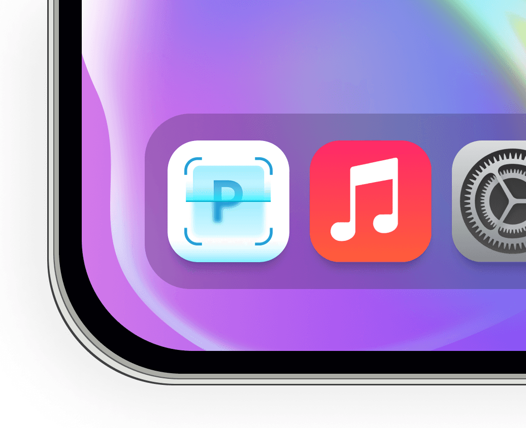
One connected workspace for property data, projects, inspections and approvals. I designed the platform end to end, alongside its branding and iPhone app icon.
MY ROLE
Lead UX/UI Designer
End-to-end product designer
Branding & app icon design
CLIENT
Bermwood Technologies
Enterprise SaaS
SCOPE
Information architecture, workflows, interaction design, UI, prototypes and design system
01 Product overview: property context, deal information, documents and next actions in a historical Walgreens screen.
01 The Problem
High-value portfolios. Fragmented workflows.
Commercial real estate teams manage property records, financial information, deadlines and approvals across large portfolios. Much of this work relied on spreadsheets, email chains, legacy systems and separate tools.
Velocity was created to bring these operations together. The design challenge was to support complex work and different customer processes through a consistent product experience.
Scattered information
Records and supporting documents lived in different places, making it harder to find the full picture.
Work outside the system
Email and separate tools carried parts of the process, splitting the work from its context.
Limited visibility
Teams needed to understand what required attention across a portfolio, not just inside one record.
Different ways of working
Organisations had different processes and responsibilities. One rigid workflow could not serve them all.
02 Understanding Drivers
Clarity was only half of the challenge.
The research described in the project covered interviews, surveys and observations of drivers reading parking signs.
The findings pointed to three connected needs: a quick answer, guidance that considers the driver's situation, and a way to understand how the app reached its answer. Interest in AI did not remove concerns about its accuracy.

ParkAid research overview
Interviews
Explore how drivers interpret restrictions and what makes them hesitate.
Surveys
Understand reported confusion, time pressure and concerns about parking fines.
Contextual inquiry
Observe the task where it happens, with real signs and competing demands.
WHAT THIS MEANT FOR THE DESIGN
A short answer needed an explanation behind it. Drivers should be able to check the rule, not just accept the result.
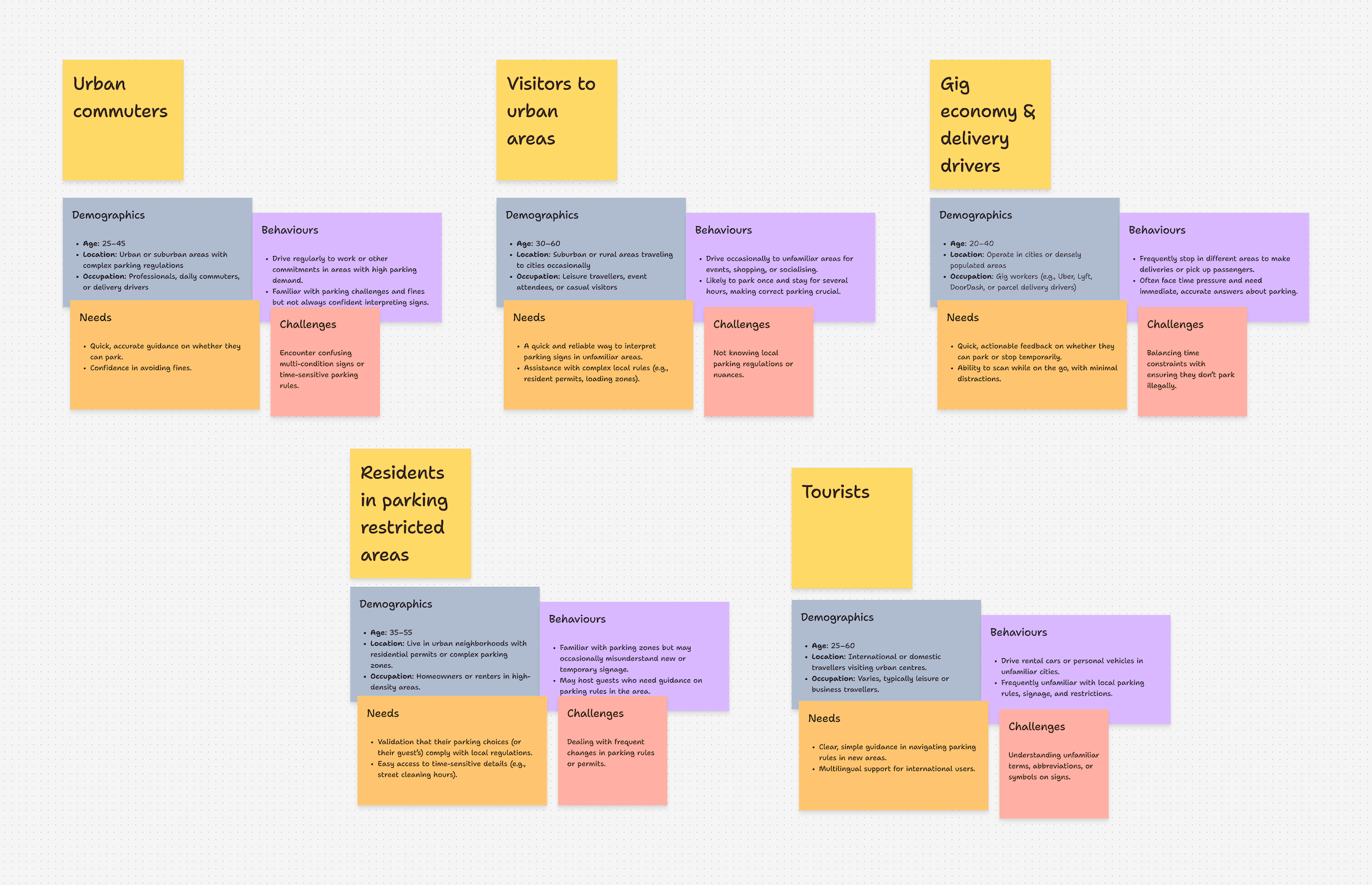
ParkAid research articaft 01
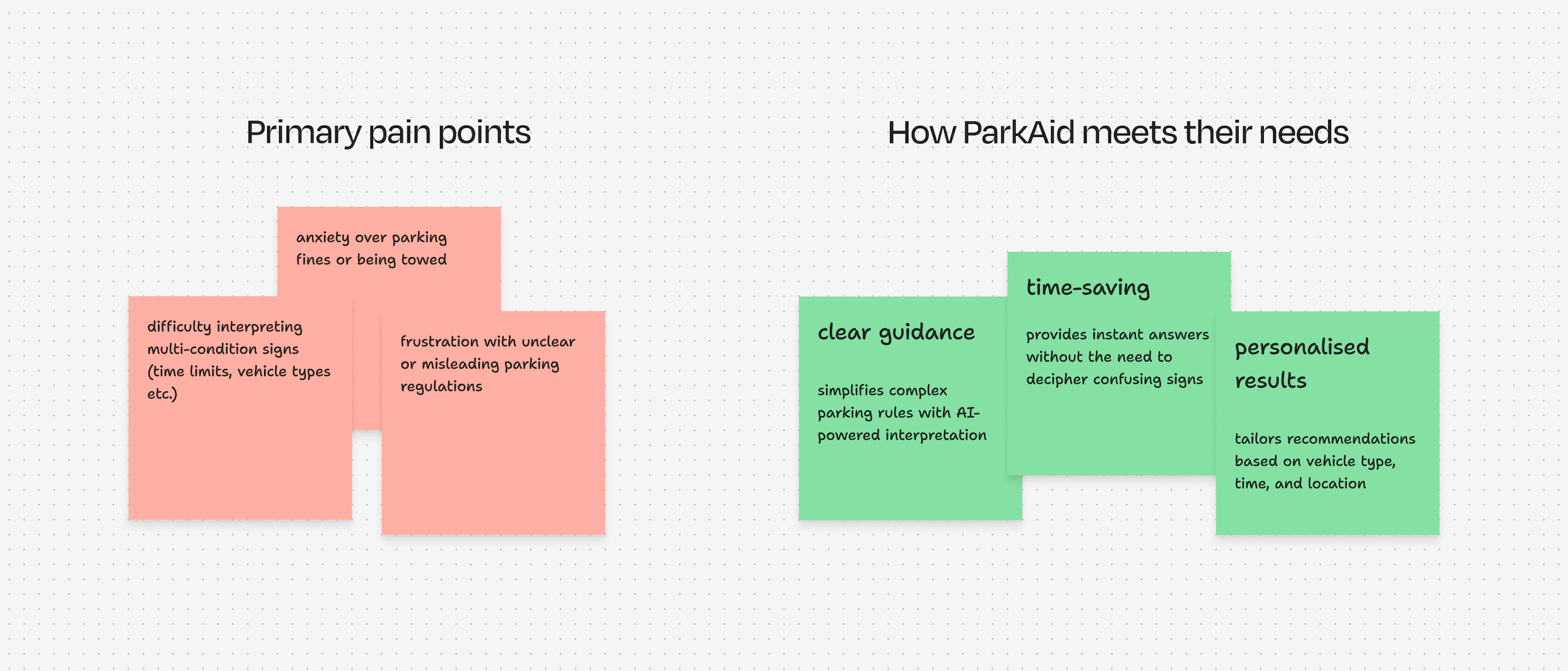
ParkAid research articaft 02
03 The Solution
Scan. Check. Understand.
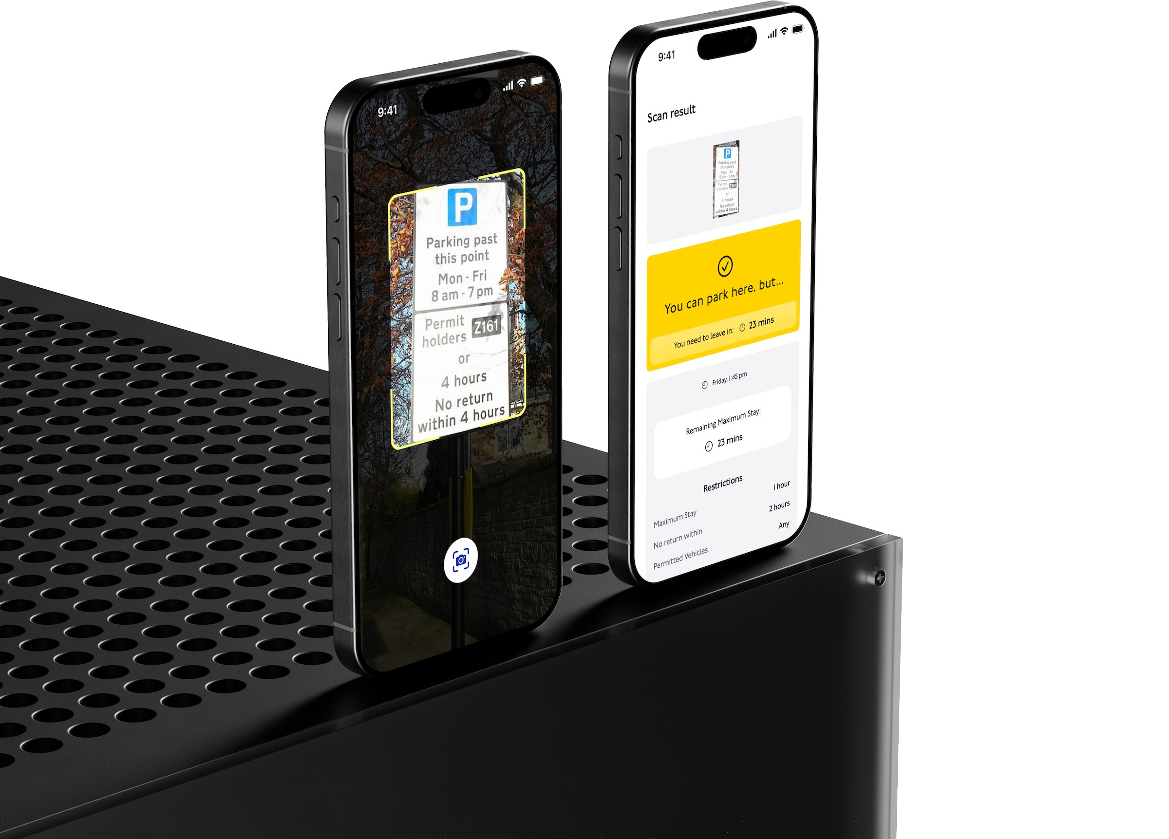
A focused journey from the parking sign to guidance the driver can inspect.
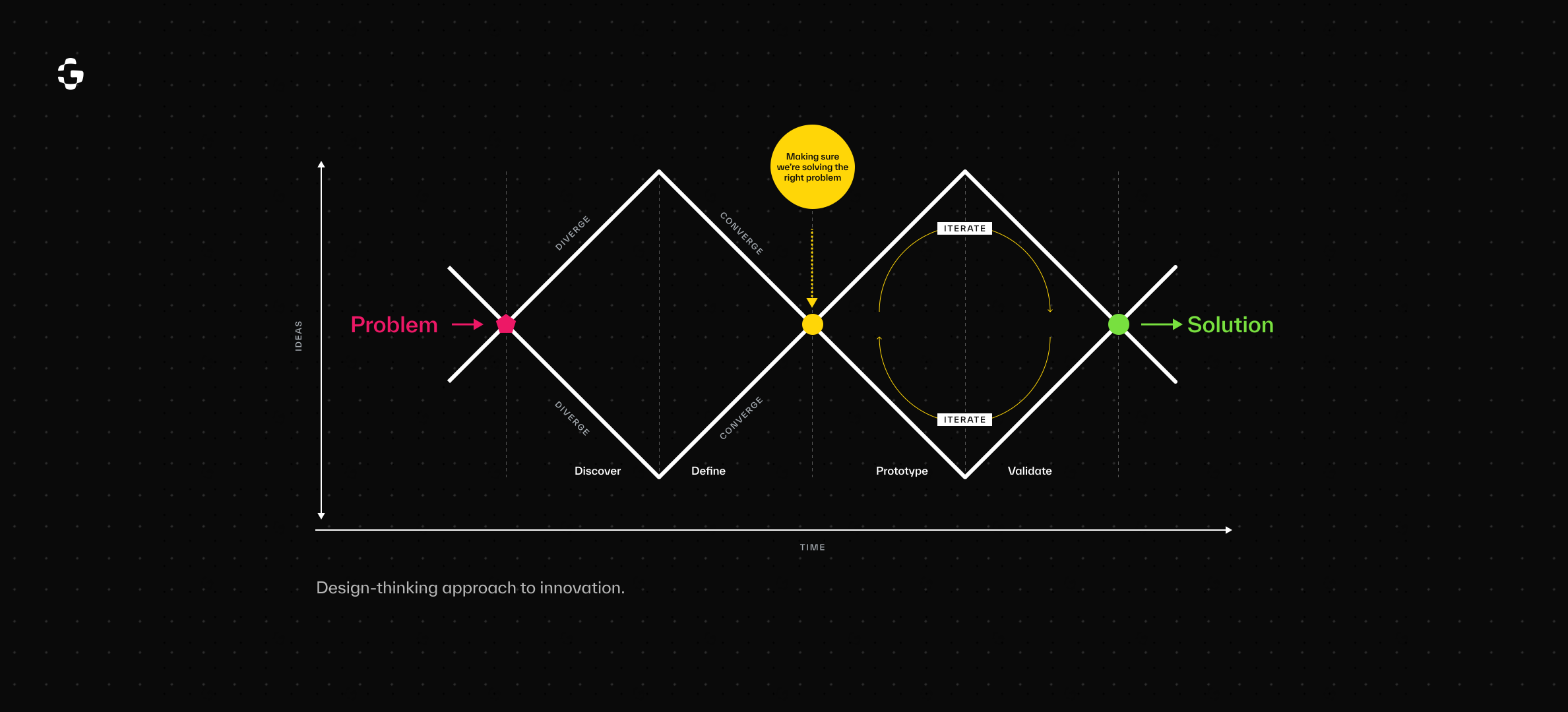
Early design exploration
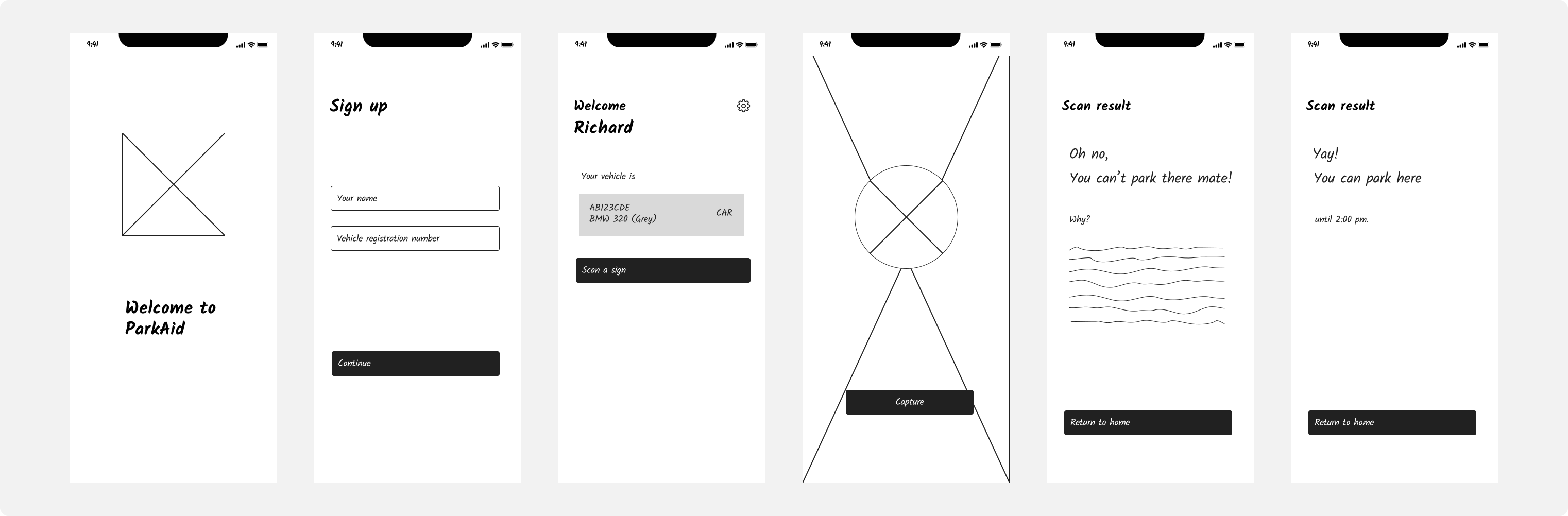
ParkAid wireframes and prototype screens
Capture the sign
01
Start with a photo of the parking restrictions.
Check the image
02
Confirm the text is clear before interpreting it.
Read the result
03
See the parking status and explore the relevant conditions.
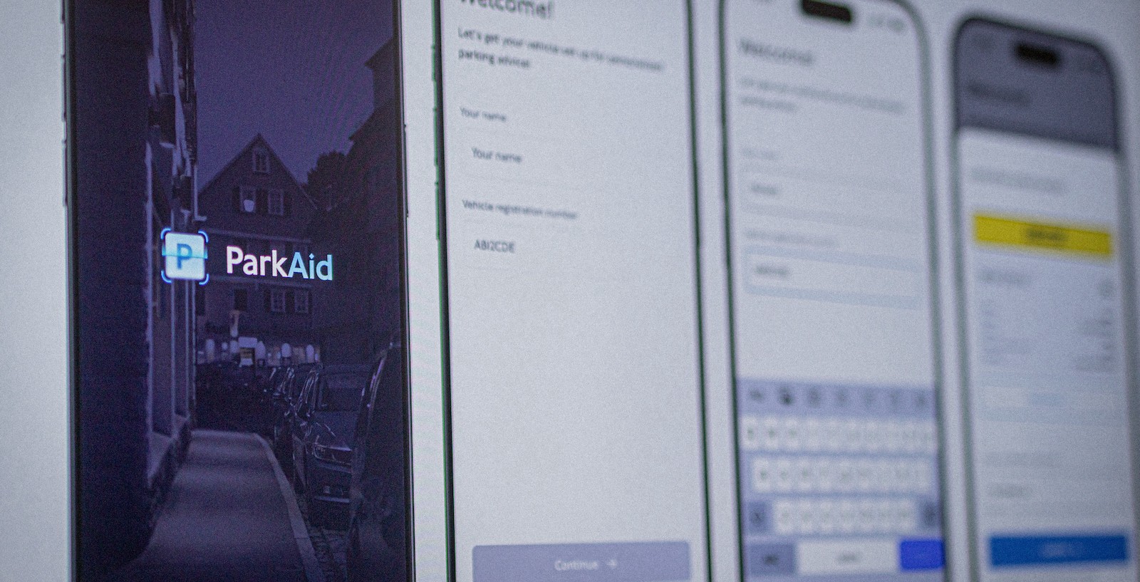
Original ParkAid high-fidelity designs
03 Design Decisions
Making the answer easier to trust.
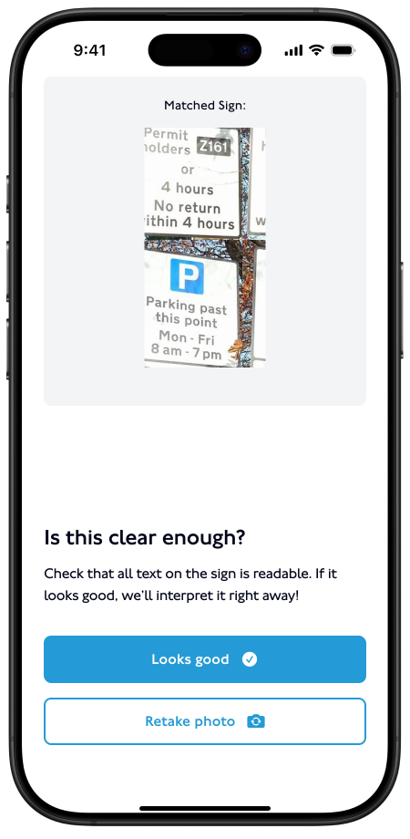
Check the photo before processing
A blurred image can affect everything that follows. The captured photo is shown back to the driver with a prompt to check whether it is clear.
The aim: catch a poor scan before it becomes misleading guidance.
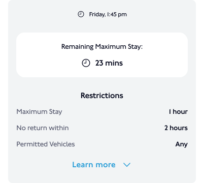
Keep the answer short, make the details available
The result gives drivers a clear starting point. Expandable conditions let them inspect restrictions without reading everything at once.
The aim: support a quick decision while keeping the reasoning visible.
Use the driver's context
Guidance considers the time and vehicle type. A general reading of a sign is not enough when a condition changes the answer.
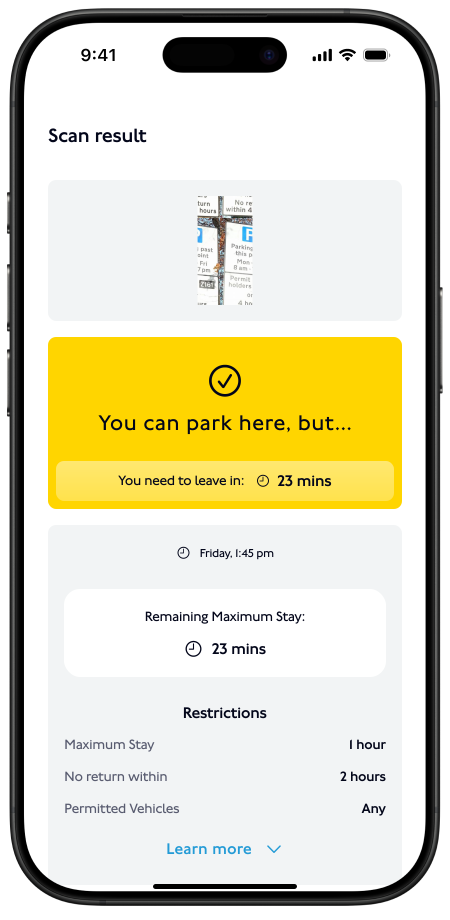
Context-aware guidance
Give failed scans a clear next step
When the sign cannot be interpreted, the recovery path asks the driver to retake the photo rather than leaving them with an unexplained failure.
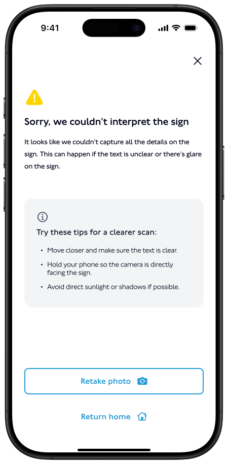
Unreadable sign recovery
Make the parking status easy to find
The result screen gives the parking status visual priority, with the conditions available below.
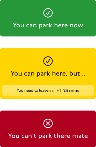
Unreadable sign recovery
04 Testing & Iteration
A fast result still needed an explanation.
The testing described in the original case study surfaced issues beyond the basic scan-and-result flow.
FEEDBACK
DESIGN RESPONSE
Drivers wanted to understand the interpretation.
Added plain-language explanations to the results, especially for rules with exceptions.
Low-light images could be misread.
Identified low-light capture as an area for further work. Improved capture and interpretation needed additional validation.
Some drivers needed other languages.
Identified multilingual support as a future development area.
The original write-up also describes a planned wider beta. Planned testing is kept separate from completed design changes here.
05 High-Fidelity Designs
The mobile experience
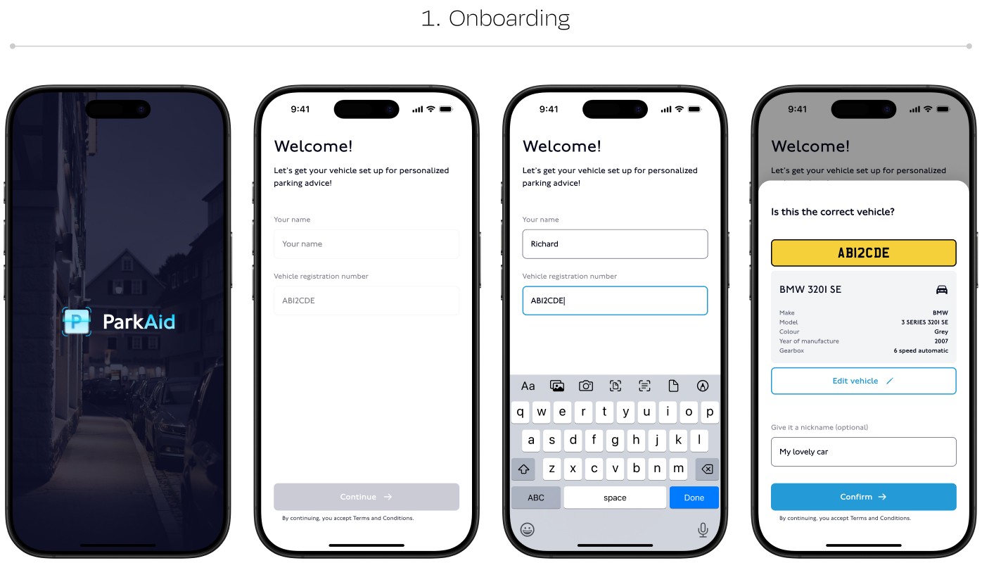
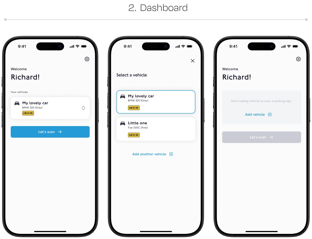
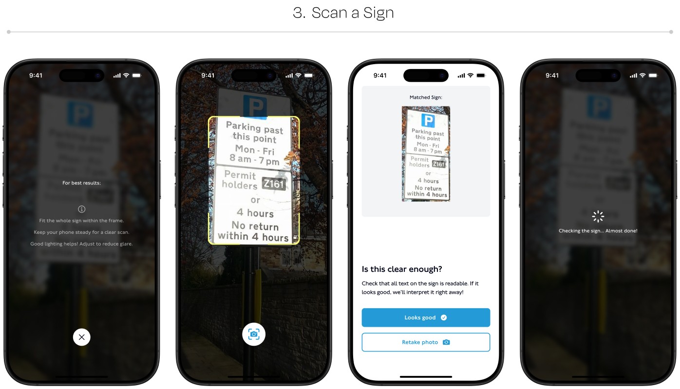
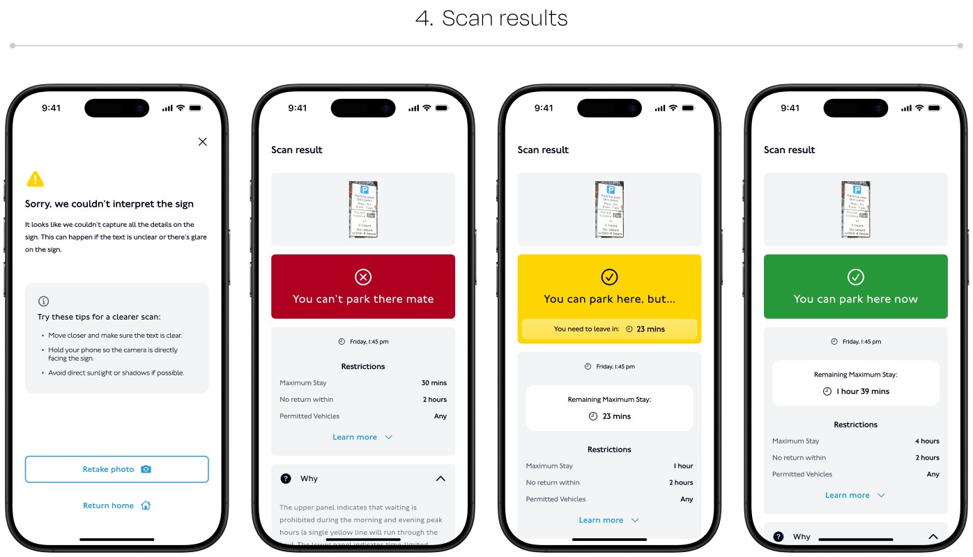
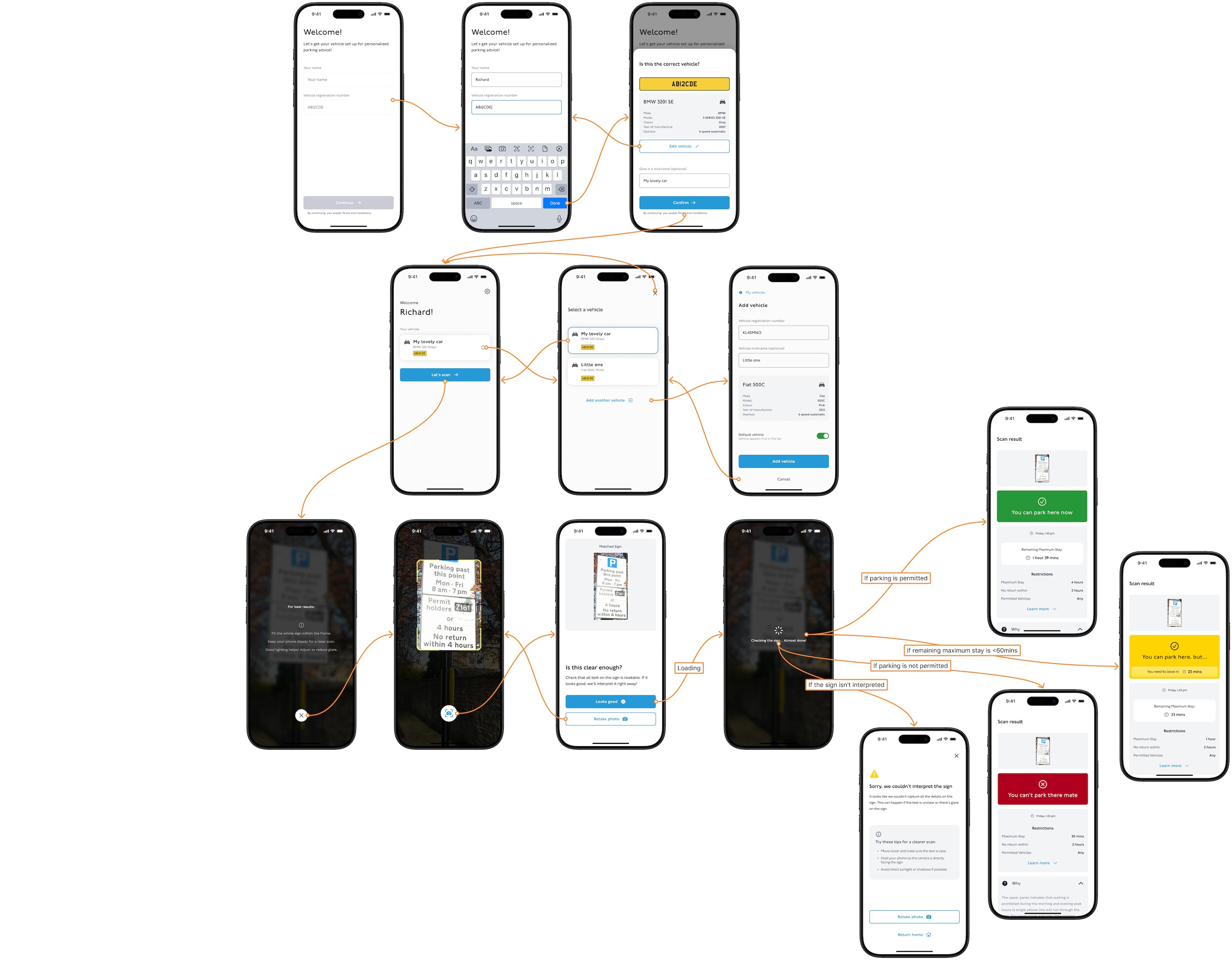
ParkAid mobile user flow
06 The Visual System
A design system build with custom components
I created a design system with custom components for ParkAid’s mobile experience.
Reusable components helped keep the screens consistent and made it easier to update the interface as the design developed. Figma variables supported shared colour choices, including light and dark modes.
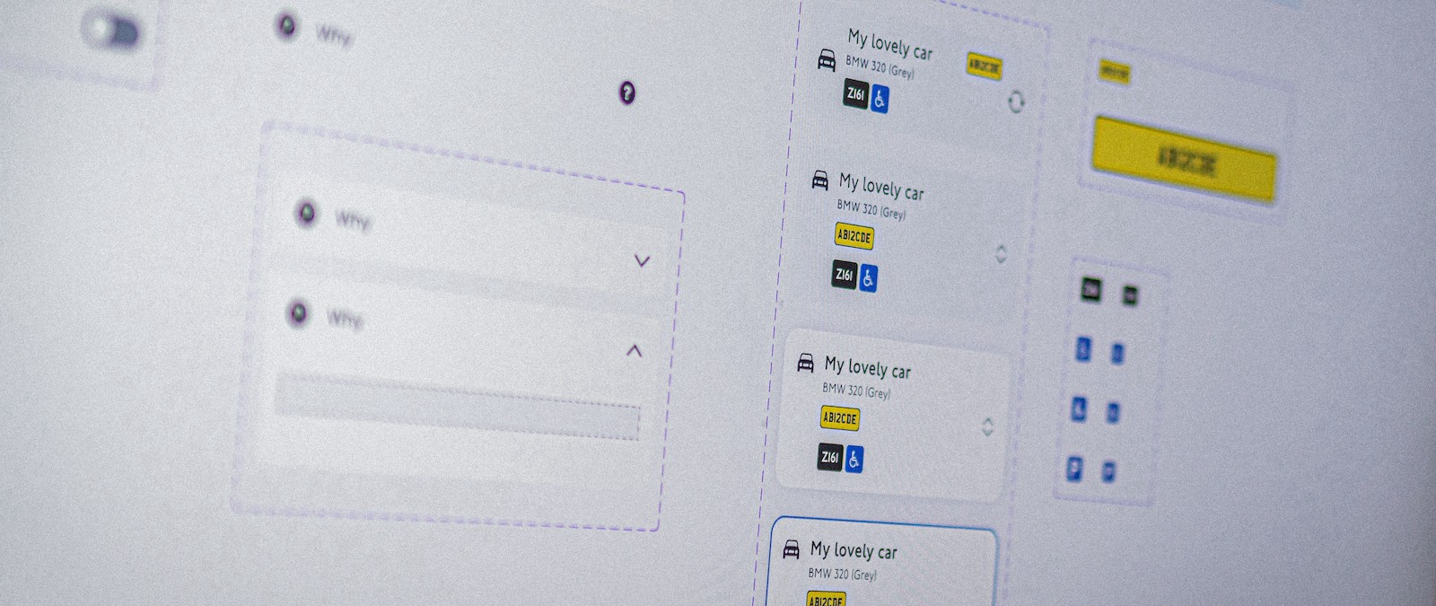
ParkAid design system
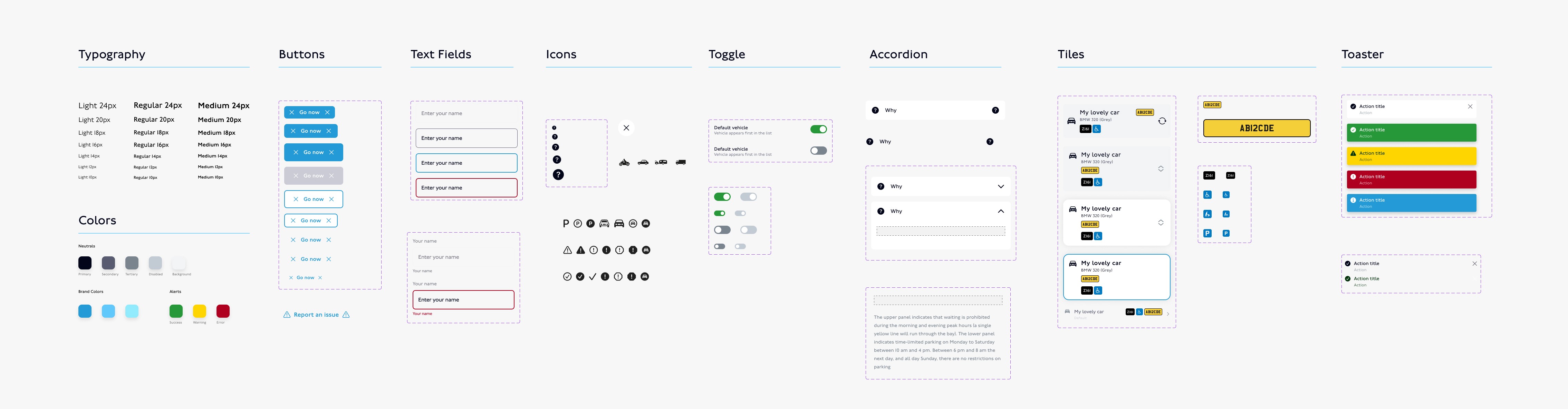
ParkAid design system
06 Branding
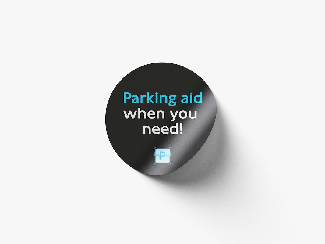
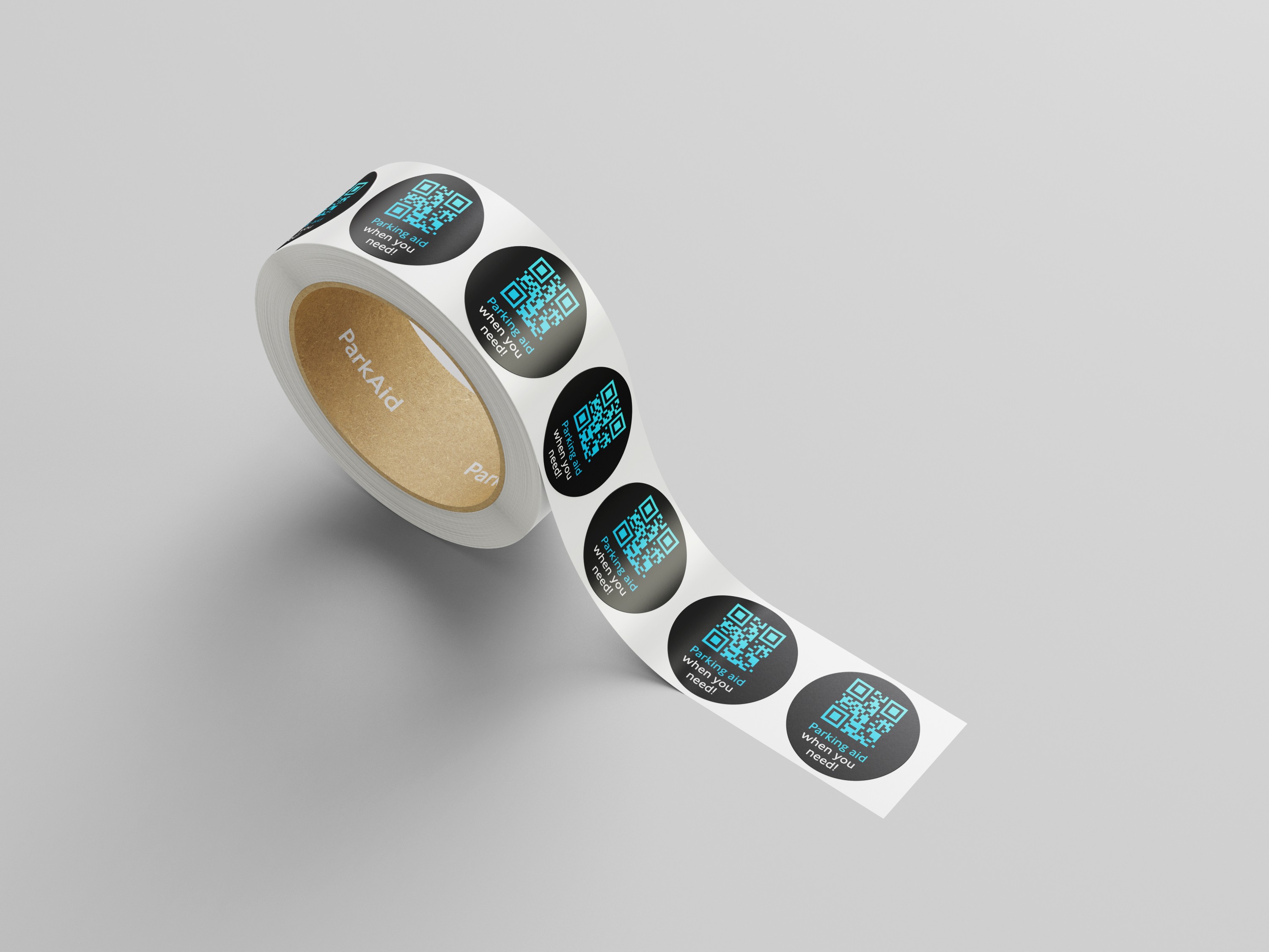
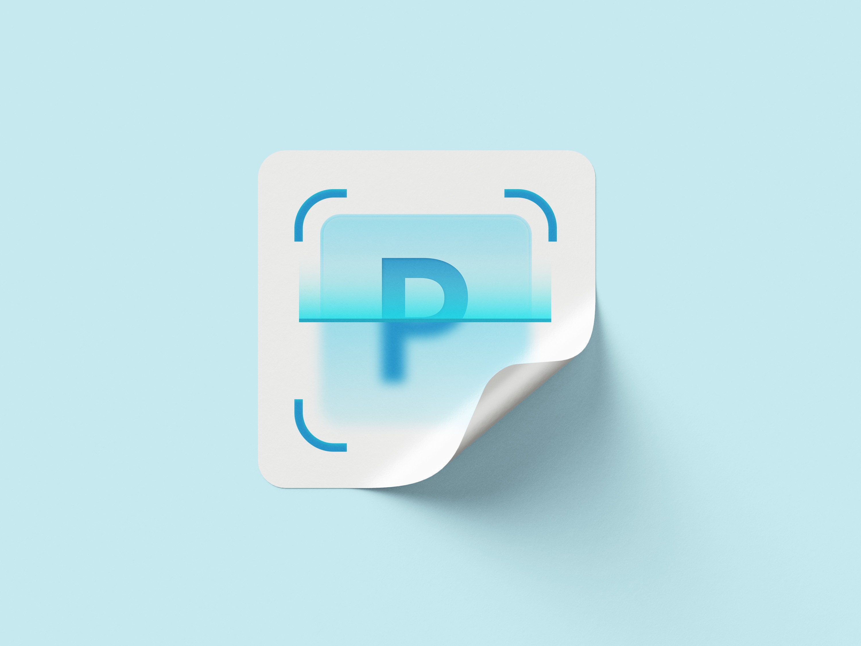
The ParkAid identity

ParkAid research overview
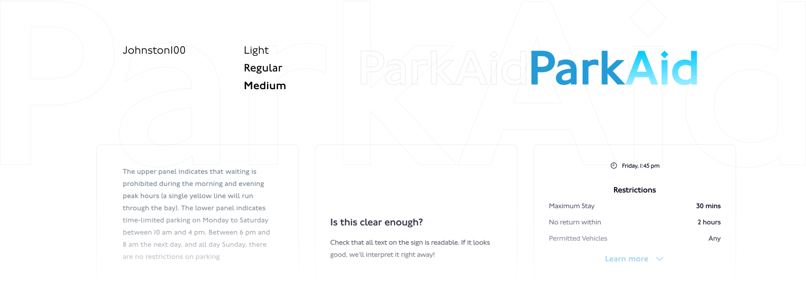

06 Project Impact
From complex rules to a focused mobile flow.
The design brings sign capture, image confirmation, parking guidance and conditions into one journey.
A clearer decision path
The experience gives drivers a result first, with the relevant restrictions available to inspect.
A way to check the input
Photo confirmation and retake guidance make recovery part of the flow.
A foundation for further development
The branding and variable-based design system support consistent screens and theme changes.
Designing an AI-assisted experience means designing the moments around the answer too. The input needs to be clear, the explanation needs to be understandable, and users need a useful next step when something goes wrong.
Test recognition in low light, check complex combinations of restrictions, and validate language support before expanding the experience.
WALGREENS / VELOCITY