Designing a new digital bank.
COMPANY
Forten Technology Ltd.
MY ROLE
UX Designer
UX, UI & design system contributions
PLATFORMS
Mobile & Web
Customer and employee experiences
PROJECT STATUS
Pre-Launch
Discontinued before public launch
TOOLS
Sketch, Abstract, Protopie, Miro, Jira, Confluence
02 UNDERSTANDING THE SERVICE
Understanding customer and staff needs
The customer persona and empathy map described people who were unsure about rates, found products hard to compare and were frustrated by having to provide the same information again. The support persona highlighted confusing interfaces and manual work when recording calls and creating tickets.
The service flows covered the steps from attracting customers and opening accounts through to assessment, decisions, ongoing support and account closure. Each screen was part of a longer process, which could include checks, interruptions or help from a member of staff.
How could we make the next step clear when several systems and teams were involved?
03 CUSTOMER EXPERIENCE
Designing for mobile and web
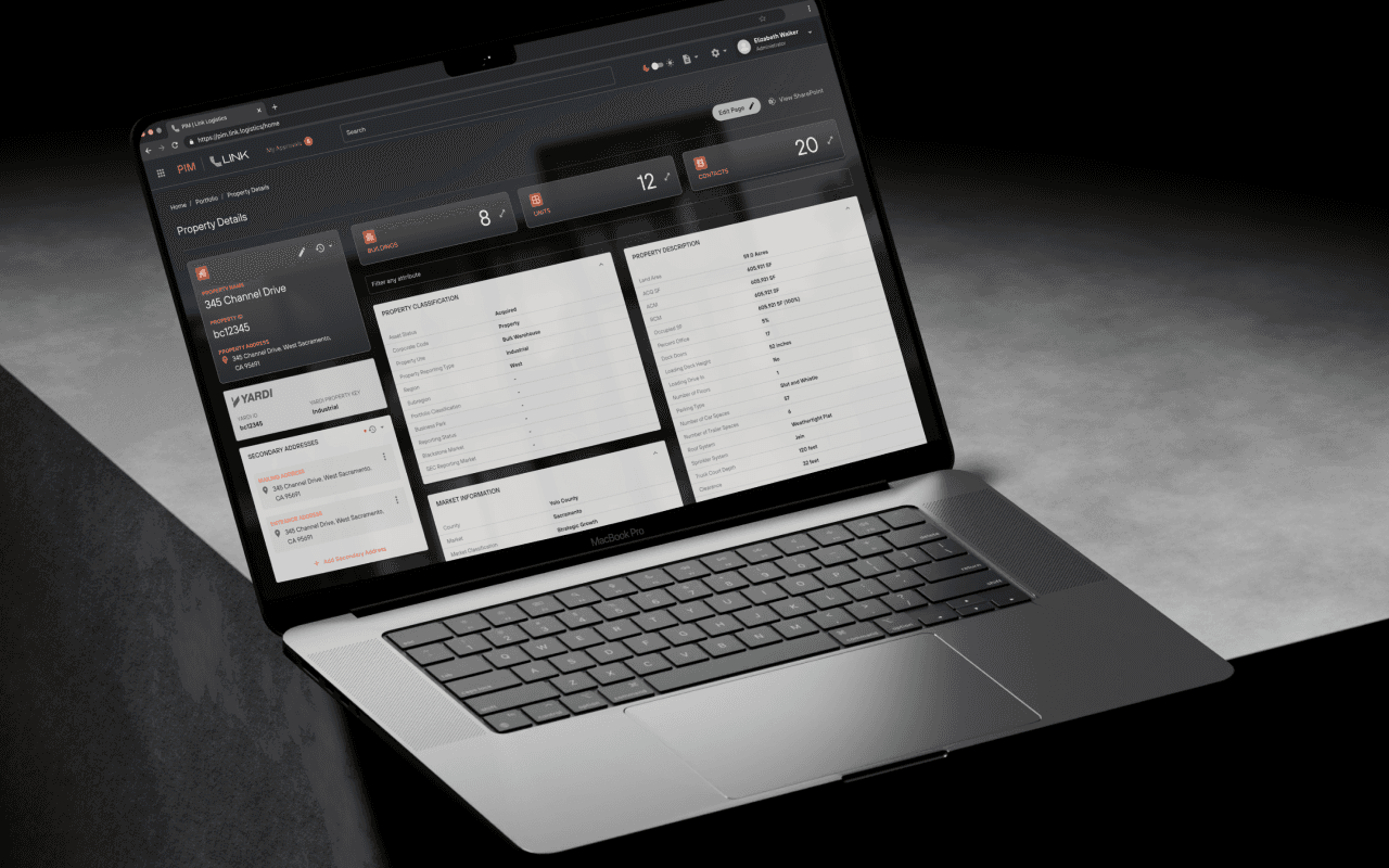
My UI work included account screens, payments, onboarding and product selection on mobile and web. The designs place account summaries above more detailed activity. Text sizes, spacing and grouping help separate the information on each screen.
The mobile designs use a compact layout with navigation at the bottom. On the web, there is more room to show navigation, account summaries and transactions side by side. The layouts reflect the space available on each device.
04 Journey Design
Explaining each step of an application
The lending documents separated eligibility checks from full applications. They also described the possible outcomes and checks made by external services. The design work included process flows, wireframes and detailed screens for eligibility, preparation and onboarding.
The interface needed to explain these stages clearly and keep important information visible. Customers needed to understand when they were verifying details, reviewing an application or waiting for a decision.
05 CUSTOMER SUPPORT
Helping staff update customer details
The lending documents separated eligibility checks from full applications. They also described the possible outcomes and checks made by external services. The design work included process flows, wireframes and detailed screens for eligibility, preparation and onboarding.
The interface needed to explain these stages clearly and keep important information visible. Customers needed to understand when they were verifying details, reviewing an application or waiting for a decision.
06 BANK ADMINISTRATION
Organising the bank admin tools
I also worked on bank administration. The design files include wireframes and UI for setting interest rates, organising savings products, managing the general ledger and controlling user access.
These screens use tables, forms and grouped settings within a clear navigation structure. They contain more information than the mobile banking screens. Staff need to understand which record they are viewing, how it is set up and what they can do next.
I also worked on bank administration. The design files include wireframes and UI for setting interest rates, organising savings products, managing the general ledger and controlling user access.
These screens use tables, forms and grouped settings within a clear navigation structure. They contain more information than the mobile banking screens. Staff need to understand which record they are viewing, how it is set up and what they can do next.

I contributed to the Forten design system alongside my work on the product screens. The libraries include colour and typography, buttons, text fields and navigation. They also cover rows, controls, filters, modals, messages and illustrations.
The system supports a consistent look and behaviour across the product. Shared components can be used in different tasks, with room to adapt them to the needs of customers and staff.
UNDERSTANDING THE PROBLEM
Why Are Parking Signs So Hard to Read?
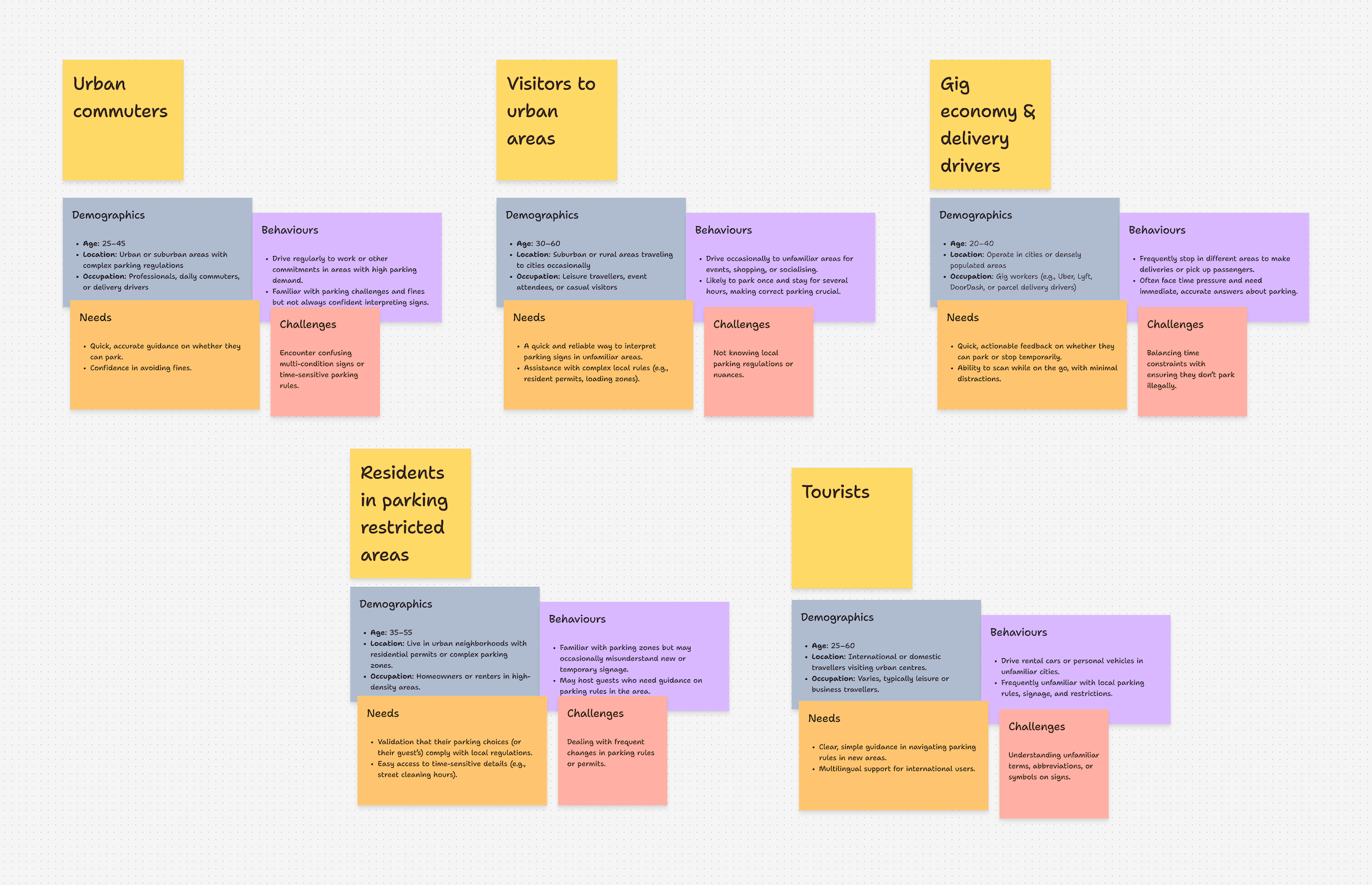
Before designing a solution, we conducted user interviews and surveys to uncover pain points.
Key Insights
One user, Sarah, shared:
“I got a ticket because I misread a sign that changed restrictions after 6 PM. If only there was a way to get a simple Yes or No answer!”
Sarah, 28
Suburban Parent
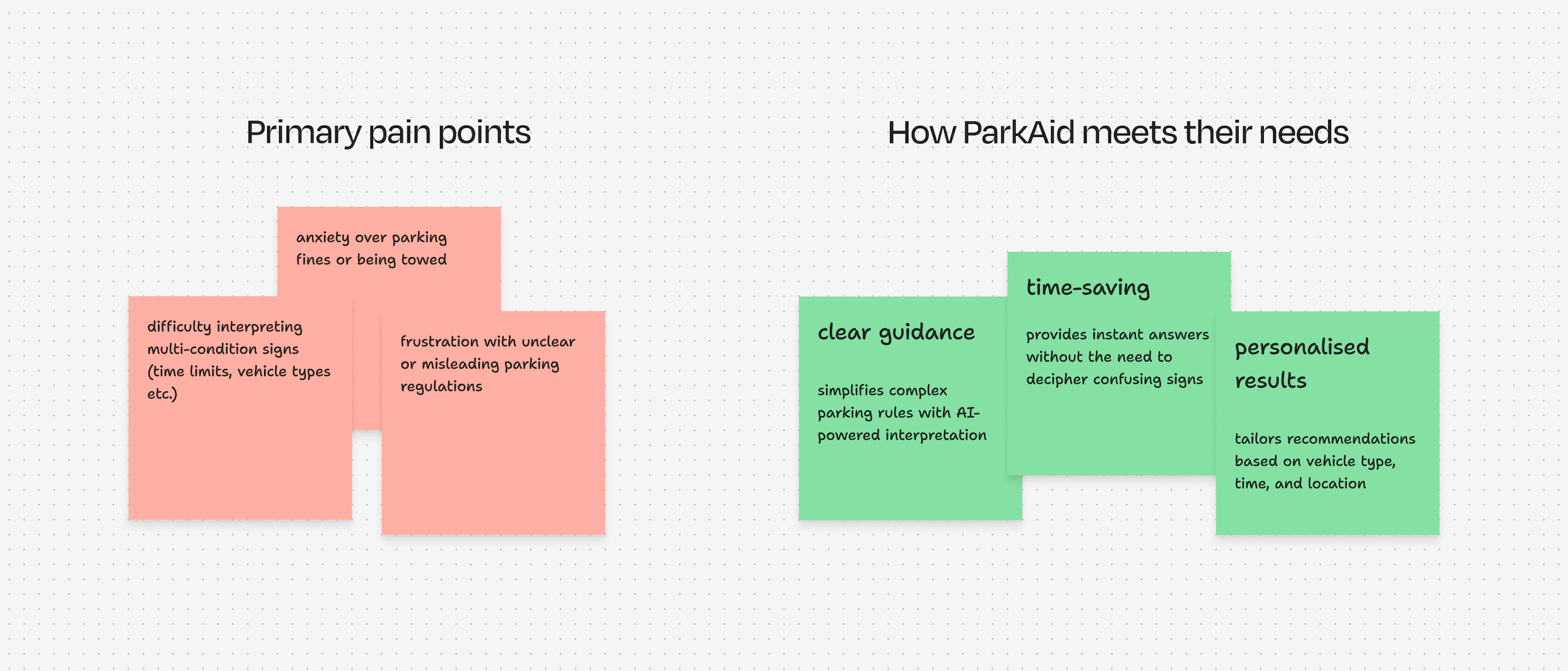
These insights shaped our core design principles: Instant clarity, real-time accuracy, and ease of use.
USER RESEARCH
Understanding the Problem

Key Findings
Trust in AI Guidance
While intrigued by AI-based solutions, users expressed concerns about accuracy and wanted transparency about how decisions were made.
DESIGN PROCESS
Designing an Effortless Parking Guide
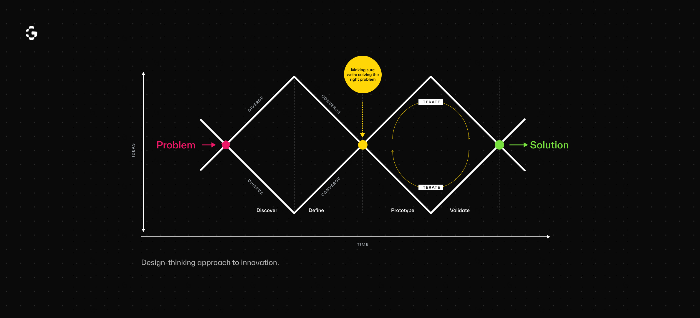
Brainstorming and Ideation
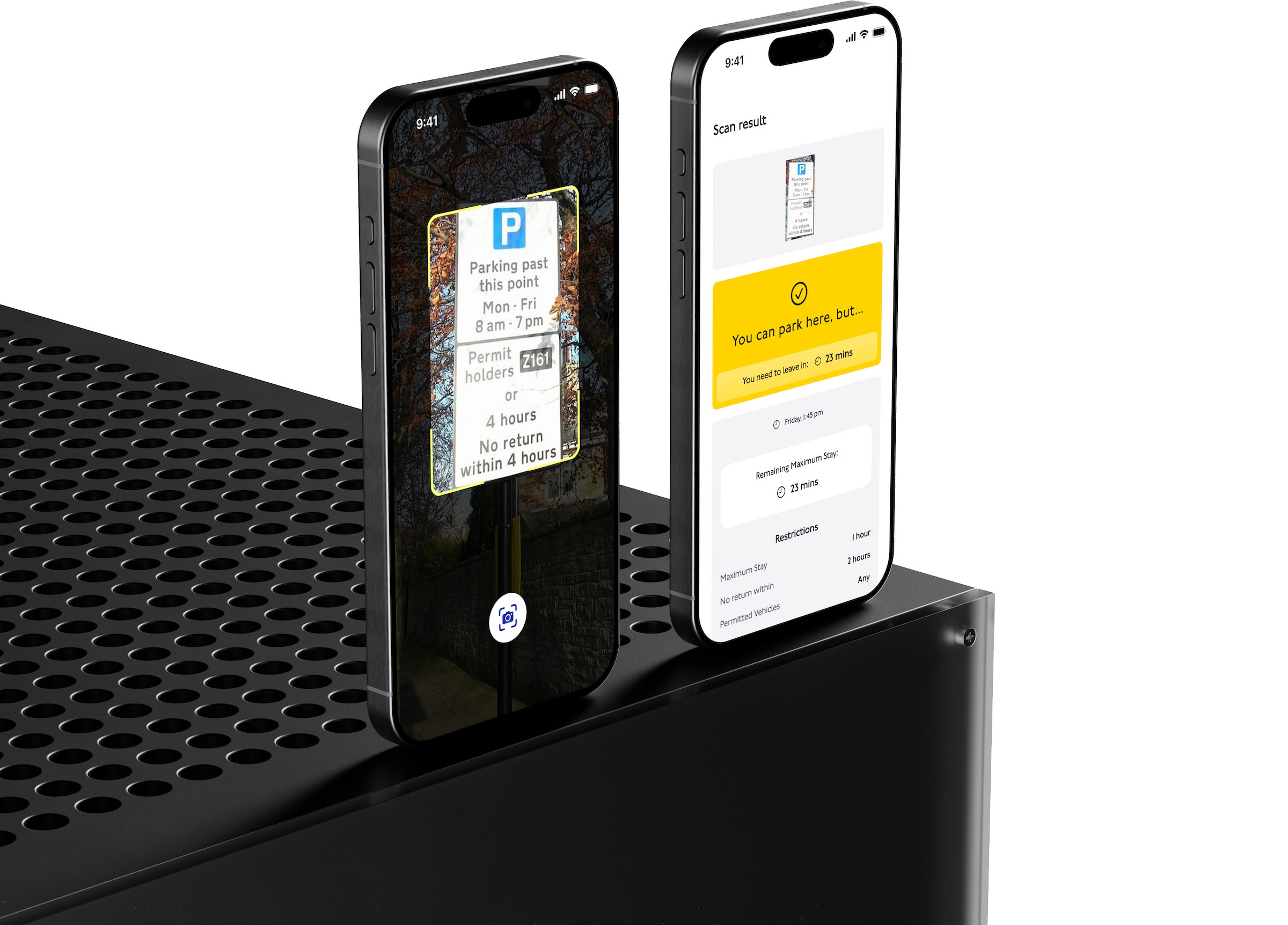
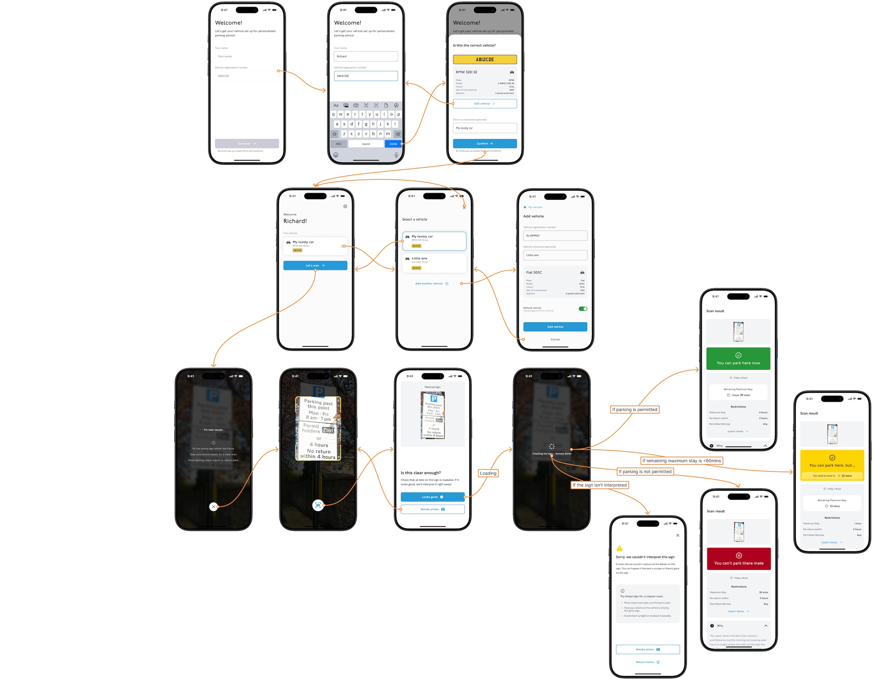
We began with rough wireframes, focusing on a simple flow: scan, interpret, and guide. We identified AI as the central solution, focusing on its ability to:
- Interpret complex signs using OCR (Optical Character Recognition).
- Factor in time, location, and vehicle type for tailored results.
Key Features
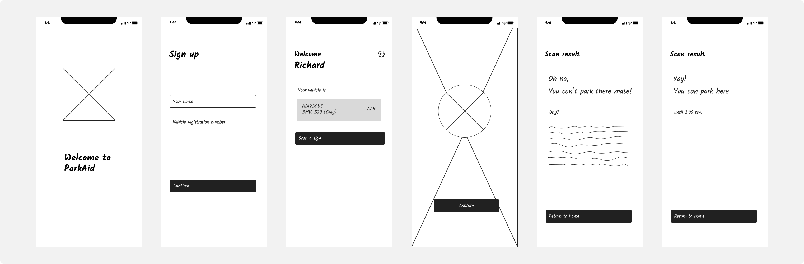
Wireframes and Prototypes
Wireframes helped us test early assumptions about flow and clarity.
USER TESTING
Refining the Experience
Phase 01
Early Prototype Testing
GOAL
Assess the effectiveness of the core scanning flow and initial AI interpretations.
participants
10 users from diverse backgrounds, including commuters, delivery drivers, and elderly drivers.
feedbacks
Users found the scanning process seamless and appreciated the quick, AI-generated results.
Users appreciated the scan-and-result flow but wanted more guidance on how the AI interpreted the signs.
In low-light areas, text on signs was sometimes misread, leading to incorrect recommendations. Users requested a night mode or brightness enhancement to improve scanning accuracy.
actions
We're actively developing a low-light mode with enhanced camera brightness and optimised OCR, set to roll out in an upcoming update.
Phase 02
High-Fidelity Testing with Real Scenarios
GOAL
Test the app in real-world environments, including complex parking zones with multi-layered signs.
participants
25 users testing the app over a week.
feedbacks
Some participants requested multi-language support for non-English speakers.
Users wanted human-readable explanations for AI decisions, especially for ambiguous rules like “No Parking Except Vehicles with Permits.”
actions
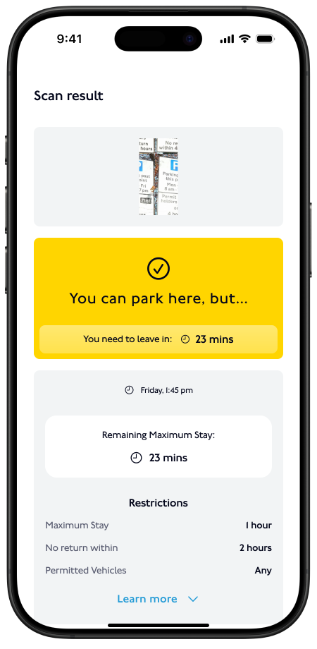
Added plain language explanations for all AI results (e.g., “You can park here from 8 AM to 6 PM unless you’re a commercial vehicle”).
Began development of multi-language support for global usability.
Phase 03
Post-Launch Beta Testing
GOAL
Gather feedback from a larger group of beta testers to identify edge cases and refine AI accuracy.
participants
We’re planning a comprehensive test with 200 users across multiple cities, evaluating performance at different times of the day and under diverse weather conditions.
Results
Adoption
85% of beta testers said they would use the app regularly.
Efficiency
Users reported a 65% reduction in time spent interpreting parking signs, with most scans yielding results in under 5 seconds.
By integrating iterative feedback, we not only refined the app’s user experience but also strengthened the AI’s performance and reliability. These improvements ensured the app could effectively address user pain points, making parking simpler and more stress-free.
Design Decisions
01
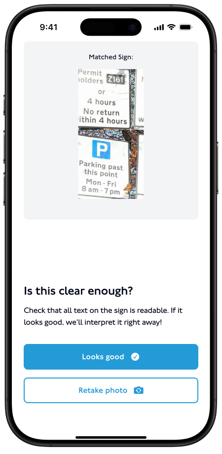
Clear Feedback for Scan Readability
REASON
Ensures accurate sign interpretation and minimises user frustration from incorrect results due to blurry or incomplete images.
DECISION
After scanning, show the captured image with a message: "Does this look clear?" This allows users to confirm readability before the app processes the image.
02
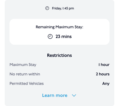
Interactive Conditions Breakdown
REASON
Breaks down complex rules into digestible parts and gives users control to explore only what’s relevant to them.
DECISION
On the results screen, display restrictions as interactive, expandable sections (e.g., "Tap to Learn More").
03
Context-Aware Messages
REASON
Personalises the experience, ensuring users feel the app understands their specific situation.
DECISION
Tailor results based on time and user input (vehicle type).
04
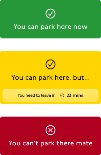
Visual Hierarchy for Parking Results
REASON
Reduces cognitive load and enables users to understand their parking status at a glance.
DECISION
Personalises the experience, ensuring users feel the app understands their specific situation.
05
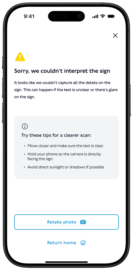
Error Handling for Unreadable Signs
REASON
Empowers users to recover from errors while keeping the experience smooth and frustration-free.
DECISION
If a sign is unreadable, show a friendly error message: "We couldn’t interpret this sign. Try retaking the photo."
HIGH-FIDELITY DESIGNS
Bringing ParkAid to Life
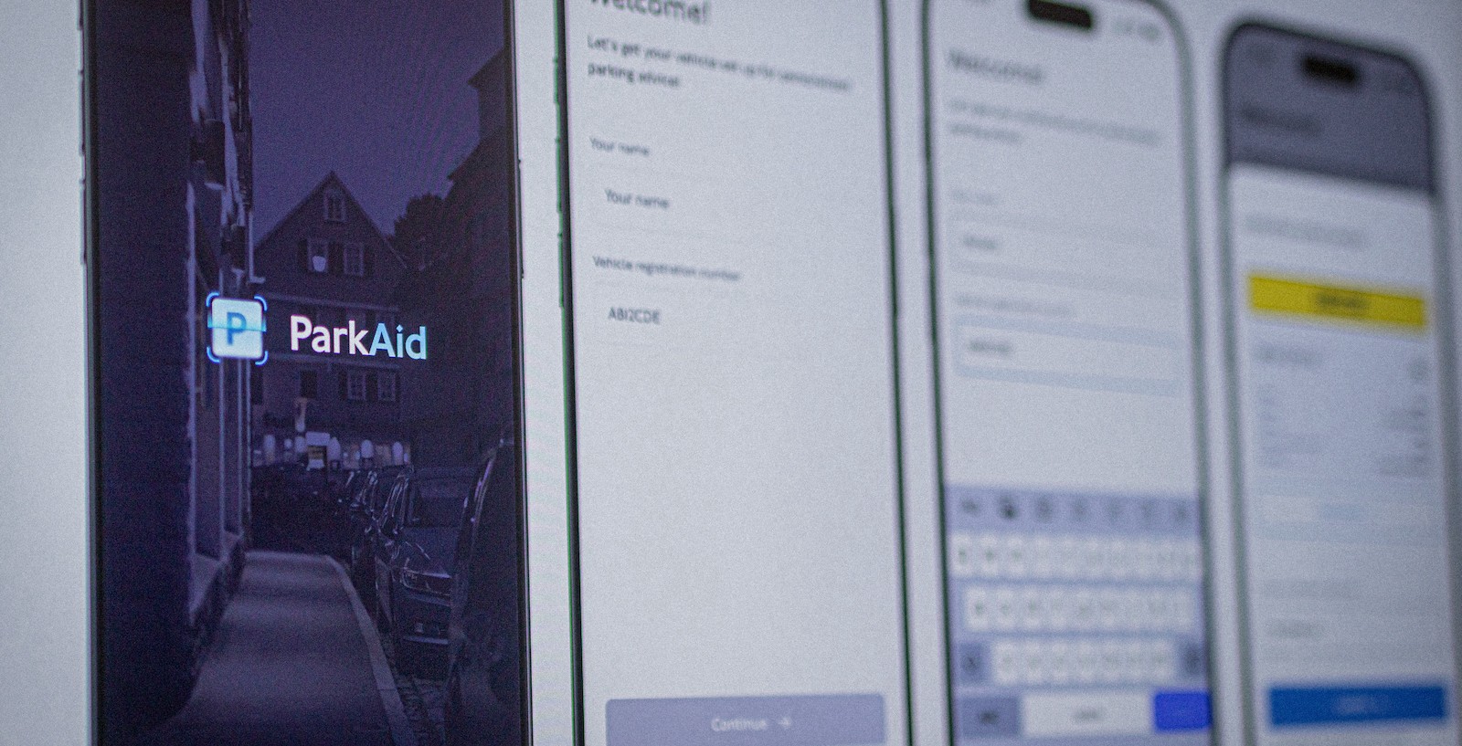
Key Screens
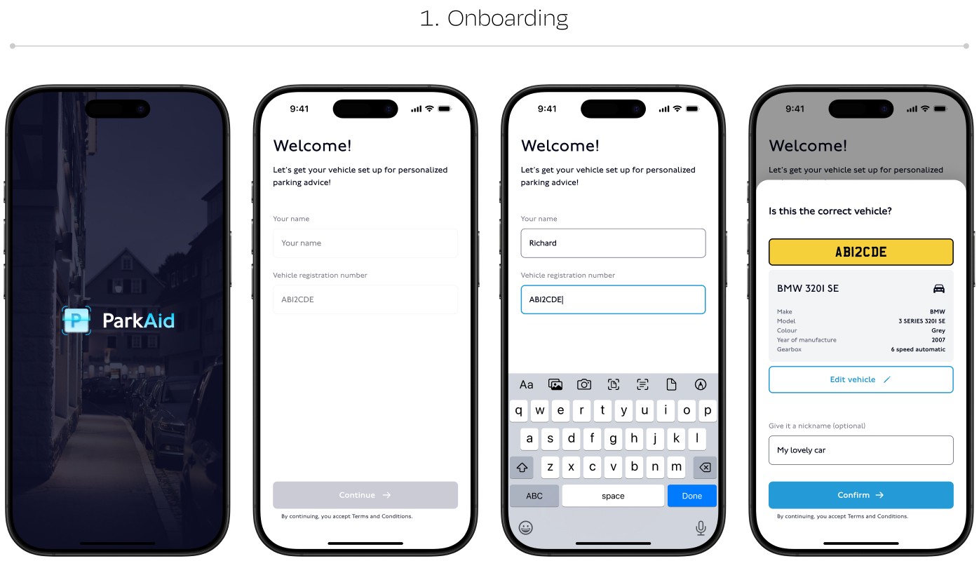
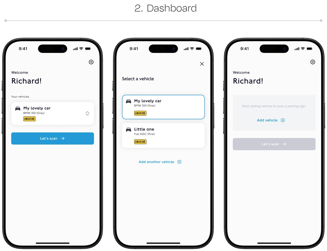
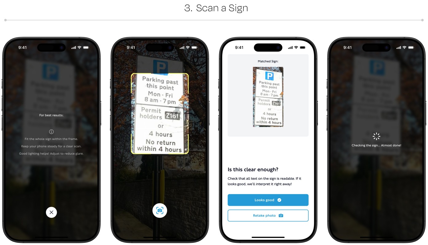
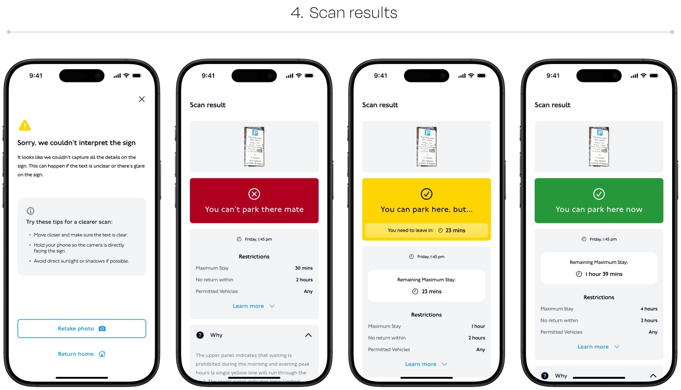
Flow
BRANDING
Crafting a Trustworthy Identity
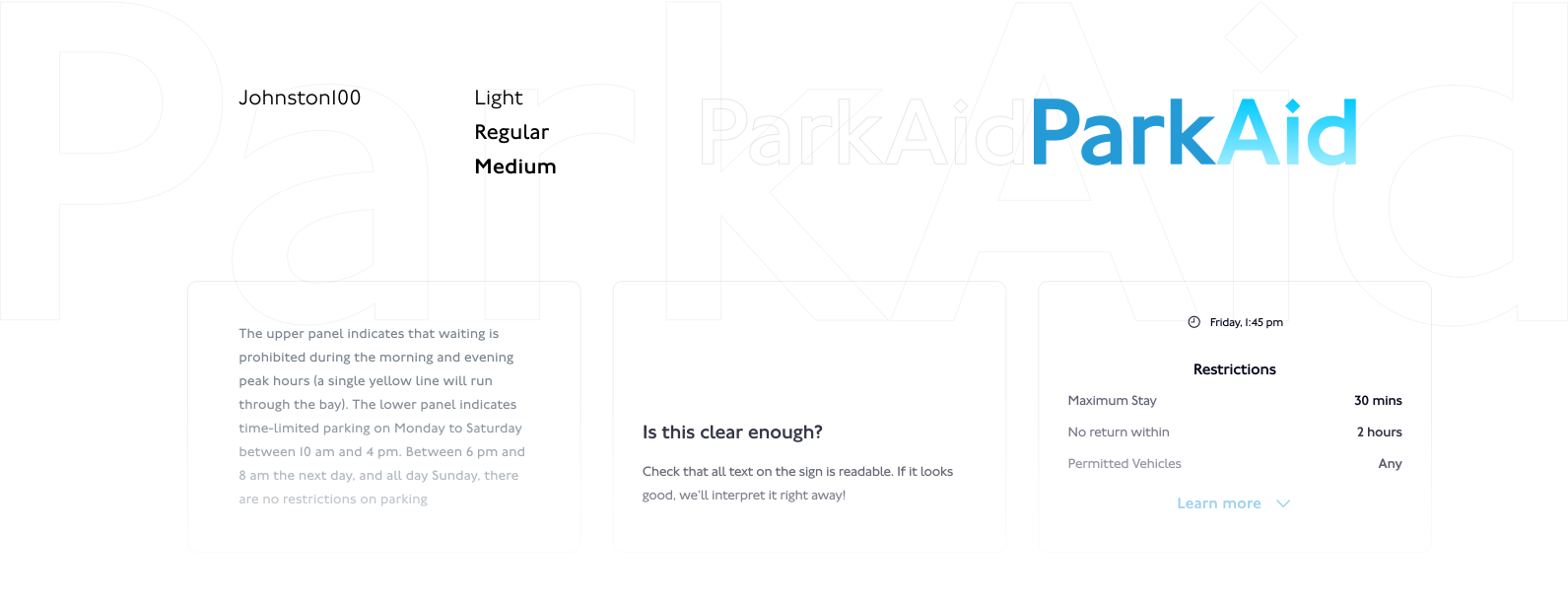
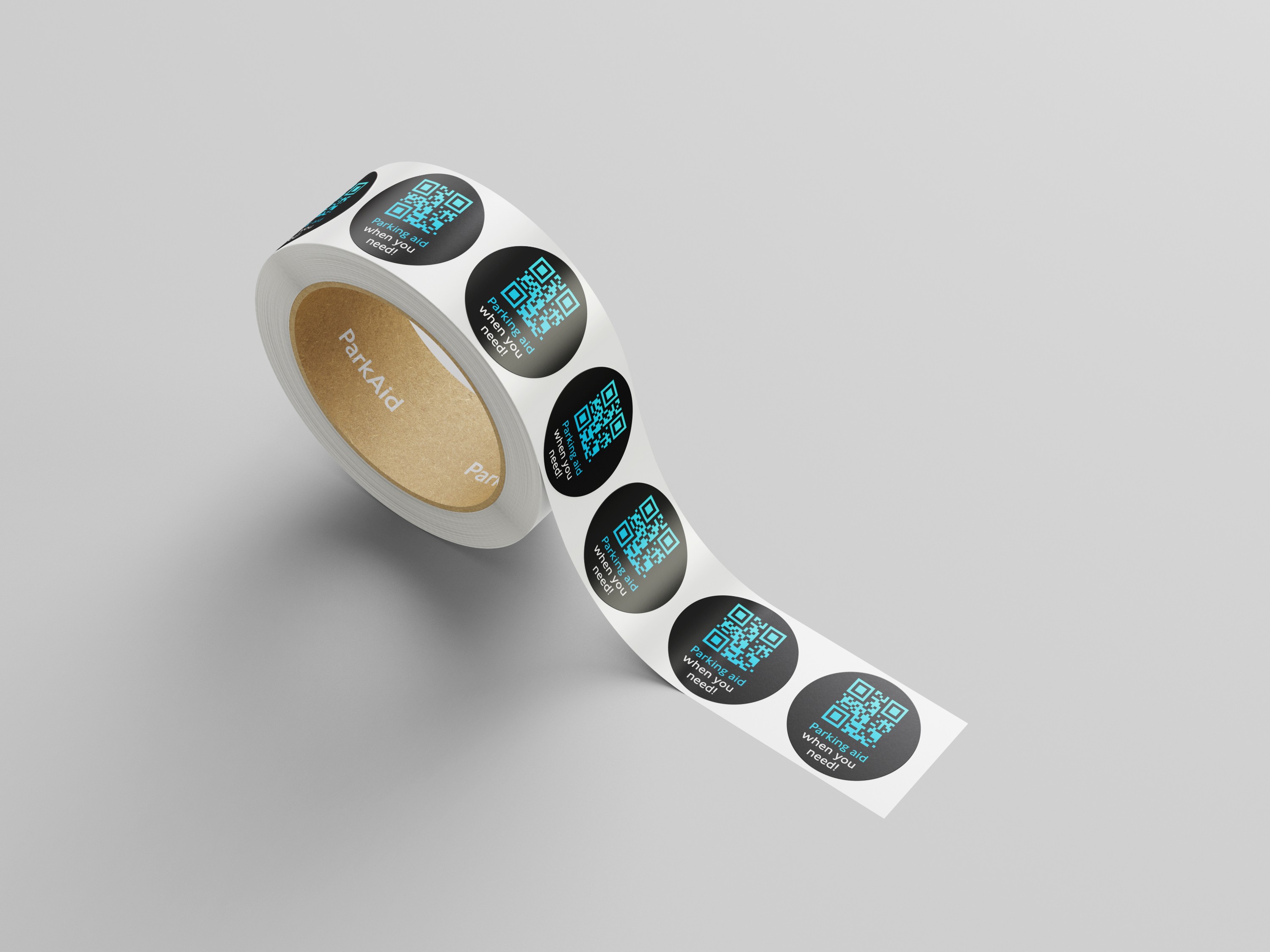
We wanted ParkAid to feel reliable, modern, and stress-free—a companion drivers could trust.



Design System
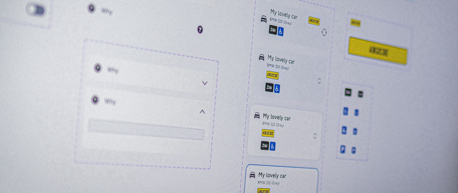
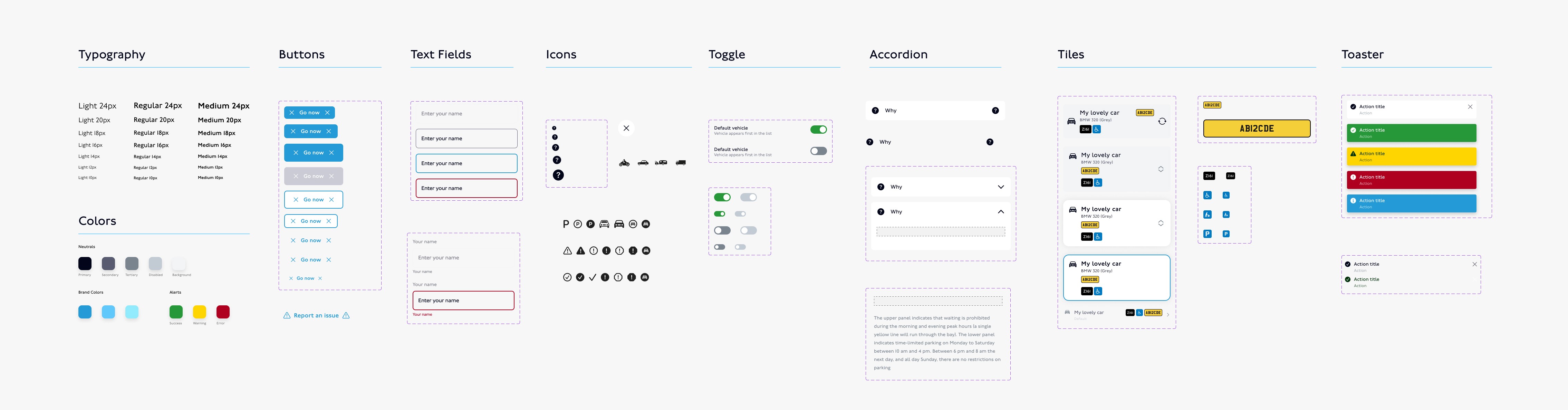
I've used variables extensively, making it very convenient to switch between dark and light modes.
THE OUTCOME
Clear Parking Guidance in Seconds
Impact
Users felt 80% more confident in their parking decisions when using the app.
The app reduced time spent interpreting signs by 65%, significantly improving user satisfaction.
Transparency features increased trust in AI, with 75% of testers expressing high confidence in its accuracy.
“This app saved me from getting a ticket! I wish I had this years ago.”
BETA TESTER
Learnings
Iterative Feedback
AI must continuously learn from real-world scenarios to improve accuracy.
Trust is key
Users are more willing to adopt AI when it explains decisions transparently.
Next Steps
Building ParkAid reinforced the importance of seamless AI integration and user trust. By prioritizing clarity and speed, we created a tool that solves a real-world frustration.
Next steps? Expanding support for international parking regulations and integrating with navigation apps for even greater convenience.